 Design can add tremendous value to a blog, as a compelling design can make a huge impact on your bottom line.
Remember design is not just about making things pretty – it’s about making things work to their best ability. But what is the process a designer goes through to create a great blog look?
1. Have a Great Toolset
What designers should minimally have at their disposal:
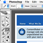
- a graphics editor (such as Photoshop, Illustrator, Freehand, etc.)
- some good inspiration
- lots of creative vision
2. Know What the Site’s Goals Are
What is the site trying to do? How will the design help you to achieve it? You must consider:
- a flexible framework to be able to add elements without ruining the overall structure
- if advertising is important make sure that the ads are not just slapped on, but carefully integrated into the design
- what are the “attention grabber” elements that will capture the first time visitors
- what elements can increase the site’s stickiness, that gives your visitors a better opportunity to stay and explore the entire blog
3. Know Who Your Audience(s) Is
Who are they? Where do they come from? By defining the visitors, you’ll be able to develop useful content that is supported by design.
4. Know What the Blog’s Functionality Needs Are
What specifically does the site need to meet its goals? Flexibility with a minimum of fuss is key here, so that the blog administrators can add advertising and content at will (without messing with the code).
Elements to consider when designing:
- how the post will look, including titles, content, and imagery
- category listing and search bar to give them an alterative way to navigate the site
- favorite posts listings and related links to drive them into the blog
- determine how comments, if used, will look and function
Know where they belong on the page for maximum impact.
5. Plan the Design
It’s time to experiment with placement and layout. Try not to get bogged down in the visual aspects, just where the elements lay because this stage is more about wireframing than design per se. Keep in mind how the eye searches and scans.
We are attracted by the following (in descending order):
- motion
- size
- images
- color
- text style (font choice, font weight)
- position
Knowing this, the elements can be more easily placed so that you are helping your readers through the page.
6. Determine The Blog’s Design Style
What kinds of images, textures, colors, typeface can give you the feel that you are looking for? You can get your inspiration from magazines, books, and the web.
7. Do the Visual Design
Now to concentrate on the site’s balance, energy, and style. Be creative with your design as you play in the editor of your choice, but remember any limitations of the template that you are implementing.
Don’t have the design skills? Contact ContentRobot and we’ll create you an eye-catching blog today.
