 So, now that we have our "starter" 3-column theme out there - how will we structure the new site?
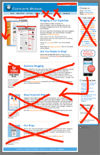
We did an audit of our site and realized that it screamed "blogging!" Now, that the concept of blogging is much more mainstream, we've decided that a much more simplified, Web 2.0 approach was required for this evolution. This means that we will:
- Create a personality that showcases our expertise, friendliness and approachability.
- Streamline the overall architecture to focus primarily on who we are, what we do, what we've done, and how to contact us / hire us.
- Reduce the navigation/menu items down.
- Tweak the color scheme and incorporate more textures into the design.
- Restructure the home page to:
- Lose the blog elements and gain a much more traditional website look. (Tho the blog itself will display the more bloggy features.)
- Shorten the copy and focus it much more toward our main offerings.
- Develop a way to display content quickly and more interestingly.
- Design feature callout areas to entice you to explore further, but not distract you from reading the main message copy.
- Redesign the blog to be easier to use, comment, share, and learn.
What do you think of this approach? What do you think about before you redesign sites (yours or others)?
